| Defining Forex | ||||
| 1. What is it? (back to top) | ||||
| a. | Forex is the largest market in the world and includes trading between large banks, central banks, currency speculators, multinational corporations, governments, and other financial markets and institutions. The average daily trade in the global forex and related markets currently is over USD $3 trillion | |||
| b. | Does not have a central location, it is traded through banks, financial institutions, and individuals | |||
| 2. Representations of different currencies (USD, CAD, etc.) (back to top) | ||||
| a. | Major currencies include the US Dollar (USD), the Euro (EUR), the Great Britain Pound (GBP), Japan Yen (JPY), and the Swiss Franc (CHF) | |||
| 1. Major traded currencies are EUR/USD, USD/JPY, GBP/USD, USD/CHF, | ||||
| b. | Minor currencies include Canadian Dollar (CAD), Australian Dollar (AUD), New Zealand Dollar (NZD) | |||
| c. | A cross currency is any currency that does not include the USD | |||
| 3. Why trade forex? (most liquid, money is constantly changing, 24-hour trade) (back to top) | ||||
| a. | Most liquid and most traded market because it is dealing with money (cash or cash equivalents) | |||
| b. | Leverage – can control and move a lot of money with a small amount of money | |||
| c. | Trade is 24 hours a day (ie. when the London market is closing, the New York market is still open, then as the NY market closes, the Japan market is opening) | |||
| d. | Market is volatile so the conversion rates are constantly trading, constantly creating opportunities to make money. | |||
| e. | Low transaction fees/no commissions | |||
| f. | No fixed lot size, can trade any amount of money | |||
| 4. Simultaneous buying/selling of currencies (back to top) | ||||
| a. | For every transaction there is 2 transactions taking place, the selling of one currency for the purchase of another | |||
| 5. How to read bid/ask prices, what is spread? Long/short | ||||
| a. | The base currency is the first currency shown in the pair (ie. GPB/USD the GPB is the base currency) | |||
| b. | A bid price is the price you can sell the base currency (at the same time buying the counter currency) | |||
| c. | An ask price is the price you can buy the base currency (at the same time selling the counter currency) | |||
| d. | Spread is the difference between the bid price and the ask price | |||
| e. | Going long is when you stand to make money if the currency rate will rise (ie. buying first, as the market is low and when it rises you would sell) | |||
| f. | Going short is when you stand to make money if the currency rate will fall (ie. selling first, as the market is high and as it drops you buy) | |||
| g. | “If a currency quote goes higher, that increases the value of the base currency. A lower quote means the base currency is weakening” | |||
| Leverage, Margin, Pips | ||||
| 1. Leverage (back to top) | ||||
| a. | A small amount of capital will give you allow you to control a large position because it will be multiplied a number of times. A common leverage is 100:1, so if you have an account with USD$1000 in it, and it was leveraged 100:1, you would be able to trade up to USD$100,000 | |||
| b. | It is used to increase buying/selling power because the market shifts in a given day are often very small, typically only around 1%, so it is necessary to trade large sums of money to make any substantial profits | |||
| 2. Margin (back to top) | ||||
| a. | Margin is minimum required to make a trade (ie. if you want to trade $100,000 and your leverage is 100:1, you need to put up only $1000 | |||
| b. | In trading stocks, you need to put up least 50% of price of stocks, the rest of the money is borrowed and interest is paid back on the money that is borrowed. | |||
| c. | In trading forex, you only need to put up 1% make the money that is made on the trade, “extra” 99% of money is collateral | |||
| 3. Pips (back to top) | ||||
| a. | Pips are the smallest unit in a currency quote or 1/100th of 1%, which is 3 decimal places out in all currencies except for the JPY | |||
| b. | In EUR/USD, a 3 pip spread would be from 1.2500 to 1.2503 | |||
| c. | In JPY, a pip is only taken out to 2 decimal places (ie. 3 pips would be 114.00 to 114.03) | |||
| 4. Mini/Micro Accounts (back to top) | ||||
| a. | Smaller amount of money, good for starters, test skills, get experience | |||
| b. | Mini account – about USD$10,000 | |||
| c. | Micro account – about USD$1,000 | |||
| Types of Orders | ||||
| 1. Market Order (back to top) | ||||
| order placed to enter or exit the market at the market price, either bid/sell price or ask/buy price | ||||
| 2. Limit Order (back to top) | ||||
| order placed to enter or exit the market at an exact placed price or better with no slippage | ||||
| 3. Stop Loss Order (back to top) | ||||
| order placed to enter or exit the market at an exact price that turns into a market order when that price is reached | ||||
| 1. A buy order above the market is a stop order | ||||
| 2. A buy order below the market is a limit order | ||||
| 3. A sell order above the market is a limit order | ||||
| 4. A sell order below the market is a stop order | ||||
| 4. * Key Principle * (back to top) | ||||
| a. | With a long position for profit, you would sell at a limit order | |||
| b. | At a long position for a loss, you sell at a stop order | |||
| 5. Order Execution Procedures (back to top) | ||||
| a. | One Cancels the other (OCO) – when either the limit or the stop order is reached, it will cancel out the other order. “Set it and forget it” | |||
| b. | Stop/Reverse Order – order that has been placed to stop at a certain price. At the same time, a new order is made in the opposite direction and reverse position by re-entering the market | |||
| c. | Cancel/replace orders – any order that is cancelled and/or replaced | |||
| Reading Charts | ||||
| 1. Line Chart (back to top) | ||||
| a. | Draws line from one closing price to another closing price. Shows a general price movement over a period of time | |||
| ex: | ||||
| 2. Bar /Open High Low Close (OHLC) Charts (back to top) | ||||
| a. | Shows opening and closing prices as well as the highs and lows of that time period. (one “bar” is one period of time, minute, hour, day, etc.) | |||
| b. | The bottom of the vertical bar indicates the lowest traded price for that time period, while the top of the bar indicates the highest price paid. So, the vertical bar indicates the currency pair’s trading range as a whole. The horizontal hash on the left side of the bar is the opening price, and the right-side horizontal hash is the closing price. | |||
Example of One Bar: | ||||
Example of OHLC: (click image to enlarge) | ||||
| 3. [Japanese] Candlestick Chart (back to top) | ||||
| a. | Indicate the high-to-low range with a vertical line. The larger block in the middle indicates the range between the opening and closing prices. Traditionally, if the block in the middle is filled or colored in, then the currency closed lower than it opened. If it is not filled in, the currency closed higher than it opened | |||
Example of Candlesticks: | ||||
| b. | Shadows are the “wicks” of the candle, showing the highs and lows of that period | |||
Example of Candlestick Chart: (click image to enlarge) | ||||
| 4. Prosticks(for more info click here) (back to top) | ||||
| a. | Utilizes basic candlestick chart, but adds more information | |||
Example of a Prostick: | ||||
| 1. Modal Point (dot) represents the most traded price of that period of time. | ||||
| 2. “Body” represents where 67% of all of the period’s trades occurred. | ||||
| 3. “Tails” are extreme 5% of the data, where smaller amounts of trading occur. | ||||
| b. | Example of Prosticks Chart: (click image to enlarge) | |||
| Fundamental Analysis | ||||
| 1. Introduction (back to top) | ||||
| a. | Looking at the market from the angle of supply and demand, focusing on the forces that drive them (social, economic, political factors) | |||
| b. | Currency is a gauge of how well an economy is doing. Strong economy equals strong currency and vice-versa | |||
| c. | Whose economy is doing well? Whose economy is doing poorly? | |||
| d. | Can give insight to market conditions, not necessarily market prices | |||
| e. | Generally create models to formulate a trading strategy. | |||
| 1. These models typically use empirical data and attempt to forecast market behavior and estimate future values or prices by using past values of core economic indicators. This information is then used to derive specific trades that best exploit this information. | ||||
| 2. Models often very subjective, can mean different things to different people | ||||
| 2. Effects (back to top) | ||||
| a. | Interest Rate Effect | |||
| 1. As country’s interest rates ↑, strength of that country’s currency ↑ | ||||
| 2. A higher interest rate in a country entices foreign investors to put their money into that country. The higher interest rate will give the investor a return of that interest rate percentage before the currency even moves. | ||||
| b. | Gold Effect | |||
| 1. Inverse Relationship between gold price and USD, so as gold price ↑, USD will ↓ or as gold ↓, USD↑ | ||||
| 2. This inverse relationship is due to gold being seen as a solid, safe commodity. If there is instability in another commodity or currency, the amount of gold purchased will rise because it is a strong commodity to have in times of instability | ||||
| 3. Example: If gold were to drop below a price level, or support, the price would be expected to keep dropping. If gold is expected to drop, the USD would be expected to rise because of the inverse relationship. | ||||
| 4. Also, the change in the price of gold can be an indicator of the direction of change in the currencies whose countries are large producers and exporters of gold (Australia, Canada) | ||||
| c. | Oil Effect | |||
| 1. As oil prices ↑, price of currency of oil-dependent country more likely to ↓, due to the sensitivity of the country’s market to oil (ie. USD) | ||||
| 3. Triangulation – Looking at other currencies (back to top) | ||||
| a. | By looking at other currencies, one can formulate possible ideas of the currency in question | |||
| 1. “ie. if the USD is having a low period, there will be an underlying bid for the EUR. This will open up the market for less liquid dollar pairs (e.g. USD/CHF) to be sold through the more liquid Euro crosses, in this case resulting in EUR/CHF selling, which introduces a Euro offer into the EUR/USD market.” | ||||
| 2. Looking at technical levels may result in inconclusive results because the levels will fluctuate. This suggests breakout traders need to allow for a greater margin of error: 20-30 pips. | ||||
| 3. “Another way to gauge whether EUR/USD is breaking out is to look to the less liquid USD/CHF and GBP/USD. If these pairs have broken equivalent technical levels, for example recent daily highs, then EUR/USD is likely to do the same after a lag. If “Swissy” and “Cable” (popular name for British pound) are stalling at those levels, then EUR/USD will likely fail as well.” | ||||
| b. | USD/JPY most politically sensitive currency conversion | |||
| 1. USD/JPY trends | ||||
| i. Japanese investors’ tendency to cluster prices | ||||
| ii. Support/resistance at numerically round numbers | ||||
| 4. Economic Indicators (back to top) | ||||
| a. | Major Indicators | |||
| 1. The Gross Domestic Product (GDP), Industrial Production, Purchasing Managers Index (PMI), Producer Price Index (PPI), Consumer Price Index (CPI), Durable Goods, Employment Cost Index (ECI), Retail Sales, Housing Starts | ||||
| b. | Information on the economy published by governmental agencies or the private sector | |||
| c. | Many people follow these indicators, so they have the ability to move prices and volume in huge amounts | |||
| Example: If the market for the USD is bearish and has been holding in a bearish position, but there is a key piece of economic data coming out toward the end of the week, such as the Gross Domestic Product (GDP), it may have a positive effect on the market and drive the currency prices up, (if the GDP is better than predicted) or a negative effect, driving prices further down (if the GDP comes out lower than expected) | ||||
| d. | 4. Knowledge of when to use each indicator, where it is important in its respective country. | |||
| 1. Often markets will move in anticipation of a certain indicator or report due to be released at a later time (anticipating a lower Unemployment report). | ||||
| 2. Importance of economic indicators in the current For example, when the U.S. dollar is weak, inflation is often one of the most watched indicators. | ||||
| 3. Importance of market expectations for the data, and whether or not the expectations are met. Occasionally, there is a drastic difference between the expectations and actual results and this may affect the market greatly | ||||
| 4. Initial reports often have revisions which may change the market substantially. Oftentimes, numbers are released and then revised, and things can change quickly. Pay attention to these revisions, as they may be a useful tool for seeing the trends and reacting more accurately to future reports. | ||||
| Technical Analysis | ||||
| Introduction (back to top) | ||||
| a. | Forecasting price movements by looking solely at market-generated data | |||
| b. | Price data from a particular market is most commonly the type of information analyzed by a technician, though most will also keep a close watch on volume and open interest in futures contracts. | |||
| c. | Stick to the basics, which are methodologies with a proven track record over a long period. After finding a trading system that works for you, the more advanced fields of study can then be incorporated into your trading repertoire | |||
| d. | Assumes that market fundamentals are already included in the market data | |||
| ie. “a technical trader will tell you that all of the fundamentals are already represented in the price. They are not so much concerned that a natural disaster or an awful inflation number caused a recent spike in prices as much as how that price action fits into a pattern or trend. And much more to the point, how that pattern can be used to predict future prices.” | ||||
| e. | Markets move in fairly predictable, quantifiable patterns called signals. Goal is to identify signals by examining past markets | |||
| f. | Prices move in trends, either up, down or sideways. Once a trend is established, it will continue that way for a period of time | |||
| Basic Concepts | ||||
| 1. Support and Resistance (back to top) | ||||
| a. | When the market moves up and then pulls back, the highest point reached before it pulled back is now resistance. As the market continues up again, the lowest point reached before it started back is now support. In this way resistance and support are continually formed as the market oscillates over time. | |||
Example of Support and Resistance: (click image to enlarge) | ||||
| 2.Trend Lines (back to top) | ||||
| a. | An uptrend line is drawn along the bottom of easily identifiable support areas (valleys). In a downtrend, the trend line is drawn along the top of easily identifiable resistance areas (peaks) | |||
Example of Trend Lines: (click image to enlarge)  | ||||
| 3. Channels (back to top) | ||||
| a. | Add a parallel line to the trend line indicators so that each trend direction now consists of two lines | |||
| 1. Use – When prices hit the bottom trend line this may be used as a buying area. When prices hit the upper trend line this may be used as a selling area. | ||||
Example of Channels: (click image to enlarge) | ||||
| Types of Technical Indicators | ||||
| 1. Trend Indicators (back to top) | ||||
| Trend is a term used to describe the continuity of price movement in one direction over time. Trends will move either up, down, or sideways. Trend indicators smooth variable price data to create a composite of market direction. (Examples: Moving Averages, Trend lines) | ||||
| 2. Strength Indicators (back to top) | ||||
| Market strength describes the intensity of market opinion with reference to a price by examining the market positions taken by various market participants. Volume or open interests are the basic ingredients of this indicator. Their signals are coincident or leading the market. (Example: Volume) | ||||
| 3. Volatility Indicators (back to top) | ||||
| Volatility is a general term used to describe the size, of day-to-day price fluctuations independent of their direction. Generally, changes in volatility tend to lead changes in prices. (Example: Bollinger Bands) | ||||
| 4. Cycle Indicators (back to top) | ||||
| A cycle is a term to indicate repeating patterns of market movement, specific to recurrent events, such as seasons, elections, etc. Many markets have a tendency to move in cyclical patterns. Cycle indicators determine the timing of a particular market patterns. (Example: Elliott Wave) | ||||
| 5. Support/Resistance Indicators (back to top) | ||||
| Support and resistance describes the price levels where markets repeatedly rise or fall and then reverse. This phenomenon is attributed to basic supply and demand. (Example: Trend Lines) | ||||
| 6. Momentum Indicators (back to top) | ||||
| Momentum is a general term used to describe the speed at which prices move over a given time period. Momentum indicators determine the strength or weakness of a trend as it progresses over time. Momentum is highest at the beginning of a trend and lowest at trend turning points. Any divergence of directions in price and momentum is a warning of weakness; if price extremes occur with weak momentum, it signals an end of movement in that direction. If momentum is trending strongly and prices are flat, it signals a potential change in price direction. (Example: Stochastic, MACD, RSI) | ||||
| Using Technical Indicators | ||||
| 1. Fibonacci (back to top) | ||||
| a. | Fibonacci Retracement Levels – used as support and resistance levels (0.236, 0.382, 0.500, 0.618, 0.764) | |||
| b. | Fibonacci Extension Levels – used as profit-taking levels (0, 0.382, 0.618, 1.000, 1.382, 1.618)] how important? | |||
| c. | 3. After a significant price move (either up or down), prices will often retrace a significant portion (if not all) of the original move. As prices retrace, support and resistance levels often occur at or near the Fibonacci Retracement levels. | |||
| d. | 4. In the currency markets, the commonly used sequence of ratios is 23.6 %, 38.2%, 50% and 61.8%. Fibonacci retracement levels can easily be displayed by connecting a trend line from a perceived high point to a perceived low point. By taking the difference between the high and low, the user can apply the % ratios to achieve the desired pullbacks. | |||
| 1. (possibly not necessary) | ||||
| 2. Swing High is a candlestick with at least two lower highs on both the left and right of itself | ||||
| 3. Swing Low is a candlestick with at least two higher lows on both the left and right of itself | ||||
Example of Fibonacci: (click image to enlarge) | ||||
| 2. Moving Averages (back to top) | ||||
| taking the average closing price of a currency for the last ‘X’ number of periods. Help traders verify existing trends, identify emerging trends, and view overextended trends about to reverse. Moving averages are lines overlaid on a chart indicating long term price trends with short term fluctuations smoothed out. | ||||
| a. | A “smooth” moving average has many days factored into its average, so the line will be more of a trend line, and will react slower to price movements. A “choppy” moving average has few days factored into its average, so will be a better indicator line and will react more quickly to price movements. | |||
| b. | Simple Moving Average (SMA) – gives equal weight to each price point over the specified period. The user defines whether the high, low, or close is used and these price points are added together and averaged. This average price point is then added to the existing string and a line is formed. With the addition of each new price point the sample set drops off the oldest point. The simple moving average is probably the most widely used moving average. However, susceptible to price spikes because it is a basic average where everything is weighted equally. | |||
Example of Simple Moving Averages: (click image to enlarge)  | ||||
| 1. Pros: Displays a smooth chart, which eliminates most fake outs. | ||||
| 2. Cons: Slow moving, this may cause a lag in buying and selling signals. | ||||
| c. | Exponential Moving Average(EMA) – An exponential moving average is another type of moving average. In a simple moving average, the price data has an equal weight in the computation of the average. Also, the oldest price data is removed from the moving average as a new price is added to the computation. The exponential moving average assigns a weight to the price data as the average is calculated. Thus, the oldest price data in the exponential moving average is never removed, but it has only a minimal impact on the moving average. | |||
Example of Exponential Moving Averages: (click image to enlarge) | ||||
| 1. Pros: Quick moving, and is good at showing recent price swings | ||||
| 2. Cons: More prone to cause fake outs and give errant signals. | ||||
| 3. Moving Average Convergence Divergence (MACD) (back to top) | ||||
| Plots the difference between a 26-day exponential moving average and a 12-day exponential moving average. A 9-day moving average is generally used as a trigger line, meaning when the MACD crosses below this trigger it is a bearish signal and when it crosses above it, it’s a bullish signal. | ||||
| a. | The two lines that are drawn are NOT moving averages of the price. They are the moving averages of the DIFFERENCE between two moving averages. A histogram is at the bottom, which measures the difference between the two moving averages | |||
| b. | Because there are two moving averages with different “speeds”, the faster one will be quicker to react to price movement than the slower one. When a new trend occurs, the fast line will react first and eventually cross the slower line. When this “crossover” occurs, and the fast line starts to “diverge” or move away from the slower line, it often indicates that a new trend has formed | |||
Example of Moving Average Convergence Divergence (MACD) : (click image to enlarge) | ||||
| 4. Bollinger Bands (back to top) | ||||
| Bollinger Bands are volatility curves used to identify extreme highs or lows in relation to price. Bollinger Bands establish trading parameters, or bands, based on the moving average of a particular instrument and a set number of standard deviations around this moving average. | ||||
Example of Bollinger Bands: (click image to enlarge)  | ||||
| a. | Because standard deviation is a measure of volatility, Bollinger Bands are indicators that adjust themselves based on the current levels of volatility in the market being studied. When prices hit the upper or lower boundaries of a given set of Bollinger Bands, this is not necessarily an indication of an imminent reversal in a trend. It simply means that prices have moved to the upper limits of the established parameters. Therefore, traders should use another study in conjunction with Bollinger Bands to help them determine the strength of a trend. | |||
| b. | Trader must specify the type and length of the moving average to be used, as well as the number of standard deviations from the mean that the Bollinger Band will measure (ie. 20 day SMA with 2 SD) | |||
| 1. Bollinger Bounce – the concept that price will typically return back to the middle of the two Bollinger Bands (so if the price hits the top Bollinger Band in one period of time, it will likely head back down and settle somewhere in the middle of the bands) | ||||
Example of Bollinger Bounce: (click image to enlarge) | ||||
| 2. Bollinger Squeeze – When the bands “squeeze” together, it usually means that a breakout is going to occur. If the candles start to break out above the top band, then the move will usually continue to go up. If the candles start to break out below the lower band, then the move will usually continue to go down. | ||||
Example of Bollinger Squeeze: (click image to enlarge)  | ||||
| 5. Stochastics (back to top) | ||||
| an oscillator (leading) that measures overbought and oversold conditions in the market. | ||||
| a. | The %K line is the faster line, more sensitive, whereas the %D is the slower, less sensitive line. | |||
| b. | Stochastics are scaled from 0 to 100. When the stochastic lines are above 80 (red dotted line), then it means the market is overbought, representing strong upward movement. When the stochastic lines are below 20 (blue dotted line), then it means that the market is oversold, with strong downward movement. Buy when the market is oversold, and sell when the market is overbought. | |||
| c. | When the %K line crosses over the %D line, this could be an indication that a market is about to reverse course. | |||
| d. | Many traders find that the best trading opportunity comes when their stochastic indicator is flattening out or moving in the opposite direction of prices. When these divergences occur, it’s time to book profits and/or to establish a position in the opposite direction of the prior trend | |||
Example of Stochstics: (click image to enlarge) | ||||
| 6. Relative Strength Index (RSI) (back to top) | ||||
| Measures the momentum of price movements. It is also plotted on a scale ranging from 0 to 100. Traders will tend to look at RSI readings over 80 as an indicator of a market that is overbought or susceptible to a downturn, and readings under 20 as a market that is oversold or ready to turn higher. | ||||
| a. | This logic therefore implies that prices cannot rise or fall forever and that by using an RSI study, one can determine with a reasonable degree of certainty when a reversal will come about. | |||
| b. | In many instances, an RSI can remain at very lofty or sunken levels for quite a while without prices reversing course. At these times, the RSI is simply telling you that a market is quite strong or quite weak and shows no signs of changing course | |||
| c. | Look for divergences between prices and the RSI. If your RSI turns up in a slumping market or turns down during a bull run, this could be a good indication that a reversal is just around the corner. Wait for confirmation before you act on divergent indications from your RSI studies | |||
Example of Relative Strength Index: (click image to enlarge)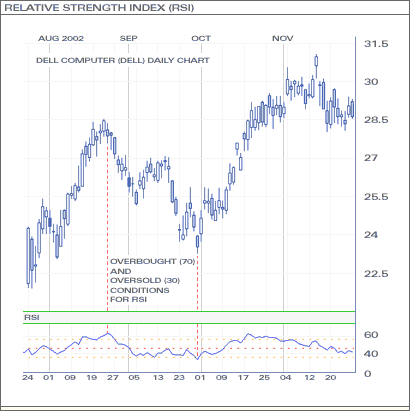 | ||||
| 7. Parabolic SAR (back to top) | ||||
| Signals where a trend comes to an end. | ||||
| a. | Places dots, or points, on a chart that indicate potential reversals in price movement | |||
| b. | The dots shift from being below the candles during the uptrend, to above the candles when the trend reverses into a downtrend | |||
| 1. When the dots are below the candles, it is a buy signal; when the dots are above the candles, it is a sell signal | ||||
Example of Parabolic SAR: (click image to enlarge) | ||||
| 8. Leading vs. Lagging Indicators (back to top) | ||||
| a. | Leading Indicators (oscillators) are economic factors that change before the economy starts to follow a particular pattern or trend. Gives a buy signal before a new trend or reversal occurs | |||
| 1. Usually when an oscillator remains in the overbought or oversold levels for a long period of time, that means there is a strong trend occurring. | ||||
| 2. Pros – predicts trends early, lets you see the trends as they develop | ||||
| 3. Cons – Not always correct, high instances of fake outs | ||||
| 4. Examples – Stochastics, Parabolic SAR, and the Relative Strength Index (RSI) | ||||
| b. | Lagging Indicators (Trend following or momentum) are economic factors that change after the economy has already begun to follow a particular pattern or trend. Gives a signal after a trend has already started | |||
| 1. Pros – gives a more concrete view of a trend, not as prone to fake outs | ||||
| 2. Cons – gives trend signals a bit late, may cause to enter a position late | ||||
| 3. Examples – MACD and moving averages | ||||
| Chart Patterns | ||||
| 1. Symmetrical Triangles (back to top) | ||||
| a. | Chart formations where the slope of the price’s highs and the slope of the price’s lows converge together to a point to make a triangle. The market is making lower highs and higher lows. This means that neither the buyers nor the sellers are pushing the price far enough to make a clear trend. | |||
Example of Symmetrical Triangles: (click image to enlarge) | ||||
| b. | As this happens and the slopes get closer, there will be a breakout, which may occur in any direction. | |||
| 1. To take advantage of the breakout, you can put in an order above the lower high slope and an order below the higher lows slope. Whichever way the market moves, you can cancel the opposite order | ||||
| 2. Ascending Triangles (back to top) | ||||
| a. | Formed by a resistance level and a slope of higher lows. There is a certain level (resistance level) which the buyers cannot break, but are beginning to test it and drive prices up, as evident with the higher lows. | |||
| 1. Often, when the breakout occurs, the buyers will win, driving the price up past the resistance level, but is not always the case | ||||
Example of Ascending Triangles: (click image to enlarge) | ||||
| 3. Descending Triangles (back to top) | ||||
| a. | Formed by a support level and a slope of lower highs. Sellers cannot break the support level, but begin to test it, as evident in the lower highs. | |||
| 1. Often, when the breakout occurs, the price will continue downwards, but not always the case | ||||
Example of Descending Triangles: (click image to enlarge) | ||||
| 4. Double Top (back to top) | ||||
| a. | Reversal after a strong move up. Tops are the peaks that try to test a resistance, but bounce off and turn downward, only to go up and test | |||
| b. | If second top does not hit the same price as the first top, it is a signal that there may be a drop because the buying power has weakened | |||
| c. | The “neckline” is the valley between the two tops, and should be used as a point of entry because of the suggestion of the reversal. | |||
Example of Double Top: (click image to enlarge) | ||||
| 5. Double Bottom (back to top) | ||||
| a. | Reversal after a strong move down. Bottoms are the valleys that try to test a support, but bounce off and turn upward, only to go down and test the support again. When this happens, a double bottom is formed. | |||
| b. | If second bottom does not hit the same prices as the first bottom, it is a signal that there may be a reversal because selling power has weakened. | |||
| c. | Above neckline as a point of entry. | |||
Example of Double Bottom: (click image to enlarge) | ||||
| 6. Head and Shoulders (back to top) | ||||
| a. | Signifies trend reversal information. | |||
| b. | It is one lower peak, followed by a higher peak, flowed by a lower peak | |||
| 1. Neckline is created by drawing a line through the points of the lowest troughs | ||||
| 2. When slope is down, indicates a stronger downward push | ||||
Example of Head and Shoulders: (click image to enlarge) | ||||
| c. | Make an entry order below the neckline | |||
| d. | 4. To set a target – Calculate distance between neckline and head, which becomes approximately how much the price will move after it breaks the neckline | |||
Example of how to set a target: (click image to enlarge)  ; | ||||
| 7. Reverse Head and Shoulders (back to top) | ||||
| Exact opposite from Head and Shoulders | ||||
| Pivot Points | ||||
| 1. What are they? (back to top) | ||||
| Pivot Points are areas at which the price direction can possibly change. There is a pivot point in the center, and then there are corresponding support and resistance levels | ||||
| Pivot Point Calculator | ||||
| a. | Generally, if a price closes above the pivot point, it is considered bullish. If it closes below the pivot point, it’s considered bearish. | |||
| b. | If price bounces off the support or resistance level a number of times, it’s a sign that the support or resistance is strong and will be tough to break | |||
| (back to top) | ||||
| Trend Indicators | ||||
| 1. Trend Lines (back to top) | ||||
| Lines which indicate if there is a trend in the market, and in what direction | ||||
| 2. Directional Movement Indicator (DMI) (back to top) | ||||
| Comprised of the ADX (average directional movement index) and the DI- and DI+ lines | ||||
| a. | ADX – used to indicate whether or not a market is trending, with a reading over 25 indicating a trending market and a reading below 20 indicating no trend. The ADX is also a measure of the strength of a trend–the higher the ADX, the stronger the trend | |||
| b. | DI+ and DI- : used as trade entry signals. A buy signal is generated when the DI+ line crosses up through the DI- line; a sell signal is generated when the DI- line crosses up through the DI+ line. | |||
| c. | Extreme point rule – states that when the DI+/- lines cross, traders should note the extreme point for that period in the direction of the crossover (the high if DI+ crosses up over DI-; the low if DI- crosses up over DI+). Only if that extreme point is breached in the subsequent period is a trade signal confirmed | |||
| Timeframes | ||||
| 1. Long Term (back to top) | ||||
| Daily and weekly charts. Weekly charts provide the longer-term perspectives trades from a few weeks to many months. | ||||
| a. | Pros – Don’t have to watch markets intraday, fewer transactions so fewer paying of spreads. | |||
| b. | Cons – Large swings/large stops, few trades in a year so need patience, large swings require large sums of money, frequent losing months. | |||
| c. | More money necessary so that you can handle large market swings without having to face a margin call | |||
| 2. Short Term (back to top) | ||||
| Use hourly charts, trade for hours up to a week | ||||
| a. | Pros – more opportunity for trades, less chance of “losing months” | |||
| b. | Cons – overnight risks, transaction costs higher | |||
| c. | Need less capital, better use of margin and have better stop-losses | |||
| 3. Intraday (back to top) | ||||
| Use Minute Charts | ||||
| a. | Pros – many trading opportunities, no overnight factor, less chance of “losing months” | |||
| b. | Cons – high transaction costs, difficult because of frequencies of trades, limited profits due to need to exit at end of day | |||
| 4. Key Principle (back to top) | ||||
| Larger the timeframe, the more important that the support/resistance levels are (they may not be shown on the smaller timeframes and give false signals ie. 1 minute and 5 minute say buy, but the 30 minute indicates a clear downward trend) | ||||
| a. | Larger the timeframe, the more important that the support/resistance levels are (they may not be shown on the smaller timeframes and give false signals ie. 1 minute and 5 minute say buy, but the 30 minute indicates a clear downward trend) | |||
| Elliot Wave Theory | ||||
| 1. Introduction – The theory states that the market moves in cycles which will repeat themselves. The Elliott Wave Theory suggests that trends consist of 5 upward waves and 3 downward waves. These waves consist of many smaller waves and that there are many waves-within-waves, called fractals. Example: When looking at one 5-3 pattern, it is made up of smaller 5-3 patterns, but it is also assumed to be a part of a larger 5-3 pattern, which is part of an even larger 5-3 pattern and so on over a long period of time. | ||||
| 2. Impulse wave – the initial 5 upward waves | ||||
| 3. iii. Corrective Waves – the 3 downward waves that “correct” the impulse wave | ||||
| 4. 5-3 Wave Patterns (example in Bull Market) (back to top) | ||||
| a. | Wave 1: (upward) people feel that stock is cheap enough to buy (real or “false reasons”) | |||
| b. | Wave 2: (downward) people who were in the original wave consider the stock overvalued and take profits. This causes the stock to go down. However, the stock will not make it to its previous lows before the stock is considered a bargain again | |||
| c. | Wave 3: (upward) typically the longest and strongest wave. The stock has caught the attention of the mass public. More people find out about the stock and want to buy it. This causes the stock’s price to go higher and higher. This wave usually exceeds the high created at the end of wave 1 | |||
| d. | Wave 4: (downward)People take profits because the stock is considered expensive again. This wave tends to be weak because there are usually more people that are still bullish on the stock and are waiting to “buy on the dips” | |||
| e. | Wave 5: (upward) This is the point that most people get on the stock, and is most driven by hysteria. This is when the stock becomes the most overpriced. Contrarians start shorting the stock which starts the ABC pattern | |||
| 1. ABC pattern: | ||||
| i. A: downward from top of wave 5 | ||||
| ii. B: upward from bottom of A, does not hit the high anywhere near top of 5 | ||||
| iii. C: downward from top of B | ||||
Example of 5-3 Pattern: (click image to enlarge) | ||||
Forex Education
Please login to join discussion